

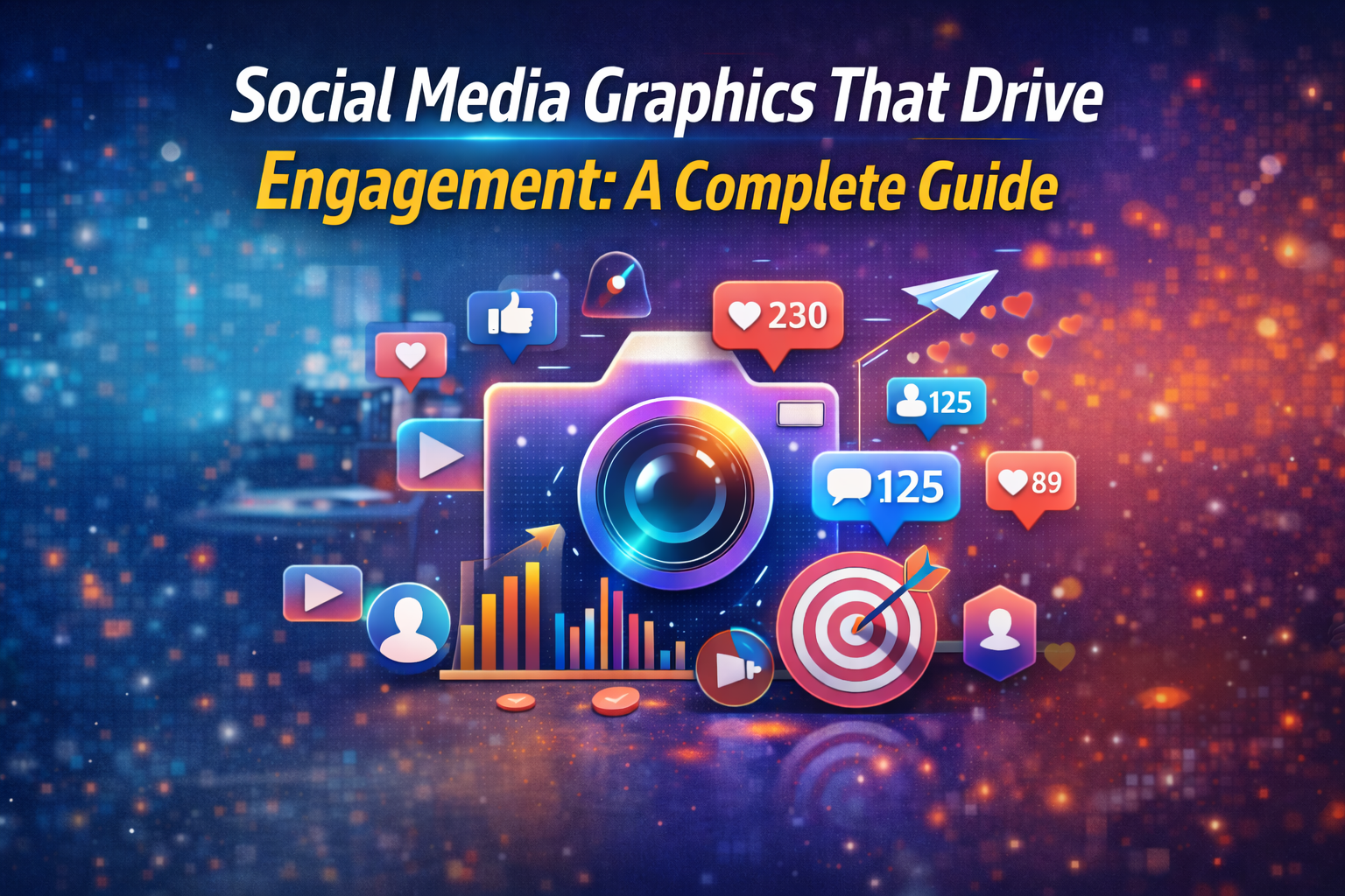
Introduction
Social media is one of the best ways for businesses to market themselves in today’s fast-paced digital environment. But with millions of postings published every day, only content that is visually appealing and interesting stands out. Graphics on social media are very important for getting people’s attention, getting messages over quickly, and getting people to like, share, comment, and follow your company.
Graphics that are well-designed do more than just look nice. They also help people connect with your business, get more people to take action, and make more sales. This guide shows you how to make social media visuals that really get people talking and help your business grow.
1. Why use social media Graphics are important
People understand pictures faster than words. Users on sites like Instagram, Facebook, LinkedIn, and X (Twitter) scroll swiftly, and pictures are what make them stop.
Advantages of having good visuals on social media:
Make your posts more visible and reach more people.
Make your brand more well-known
Get more likes, comments, and shares
Get information across faster
Create trust and professionalism
Research shows that posts with pictures get a lot more interaction than posts with merely text.
2. Know Who You’re Designing For Before You Start
To make visuals that people will want to look at, you need to know who you are creating for.
Important things to think about:
Group of people
Hobbies and way of life
Preferences for platforms, such Instagram vs. LinkedIn
Needs and problems
As an example:
Younger people want bright colours and modern layouts.
Business people like graphics that are clean and professional.
Even if the design seems beautiful, it may not get people involved if you don’t know who they are.
3. Use the same brand every time
Being consistent promotes trust and recognition.
Always include the following in your graphics:
Colours of the brand
Where to put the logo
Style of font
Tone of voice
People should be able to tell what your brand is right away when they see your postings, even if they can’t see your emblem properly.
For example, Nike and Zomato use the same colour scheme and visual design throughout all of their postings, which makes their material easy to spot.
4. Keep the design simple and clear
Too many features in a design might confuse users and make them less interested.
Best ways to do things:
Use as little text as possible
Focus on one main point
Leave ample white space
Don’t use too many colours or typefaces
Make the call to action clear
Simple designs work better since you can tell what they are right away.
5. Make sure graphics look good on each platform
Distinct social media sites have distinct size needs and ways that users act.
For example:
For Instagram, square or vertical postings are best.
Facebook: Landscape and square layouts
LinkedIn: Pictures that are clean and professional
Tales and Reels: Designs that fill the screen vertically
If you use the wrong size, your material may get cut off and lose its impact.
6. Use Icons and Pictures of Good Quality
Images with low resolution are less trustworthy.
Always use photographs with a good resolution.
Don’t use photographs that are pixelated or stretched.
Use icons and pictures that seem professional
Good images make your brand look like it has been around for a while and is trustworthy.
7. Include human and emotional elements
People relate to faces and feelings more.
Things that make you want to do something are:
Happy faces
Pictures of real teams
Pictures of everyday life
Situations that are easy to understand
These things make your material seem more human and friendly, which makes people want to read it more.
8. Design Based on Data
Design should not only be based on inventiveness, but also on how well it works.
Track:
Which designs are the most popular
Which colours work better
Which formats garner more shares?
Which layouts get more clicks
Using analytics can help you make better designs and get more people to interact with them.
9. Include a Clear Call to Action (CTA)
Every image should tell people what to do.
Follow us, learn more, and shop now are all examples of CTAs.
Call us today to book
If you don’t include a call to action (CTA), people can like your content but not do anything.
10. Get professional help and design tools
Canva, Adobe Express, and Figma are some of the tools that enable you make good-looking designs rapidly.
But competent designers make sure:
Consistency in branding
Better strategy for visuals
Better quality of engagement
Hiring a professional to make graphics for your social media saves you time and gets you better results.
Final Thoughts
Graphics on social media aren’t just for looks; they may also be used to communicate. Good images get people’s attention, help people remember your brand, and get them to interact with your content.
Businesses can turn regular articles into high-performing content by knowing their audience, keeping their brand consistent, keeping their designs basic, and making sure they work well on all platforms.
In a crowded digital arena, having good visual material is important for staying relevant and building your online profile.
📞 Contact AstraSoft Digital Marketing Company:
Call: +91 9895823231
Email: info@astrsofttech.com
Website: www.astrasofttech.com